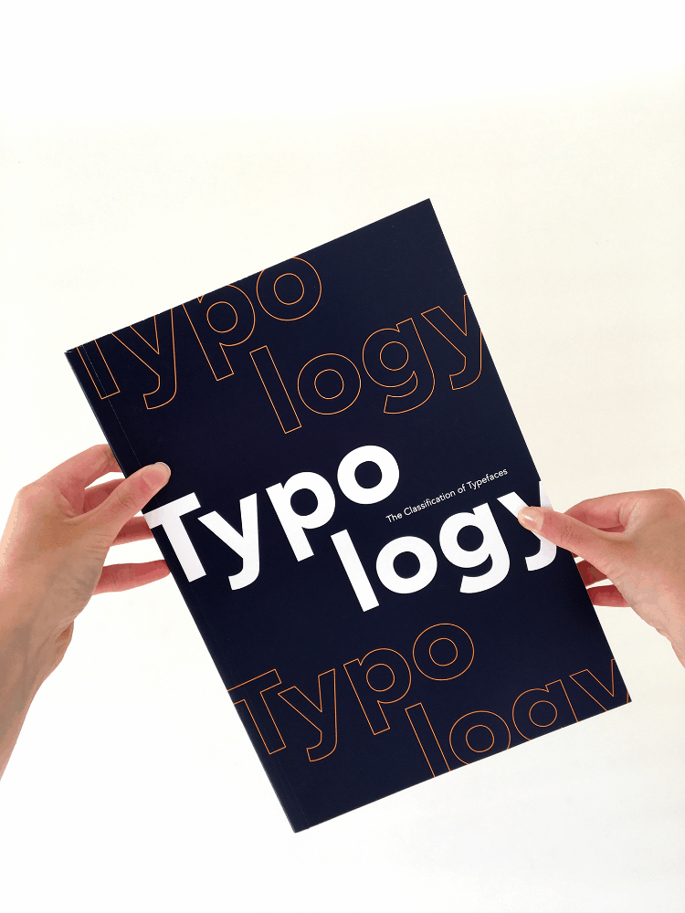
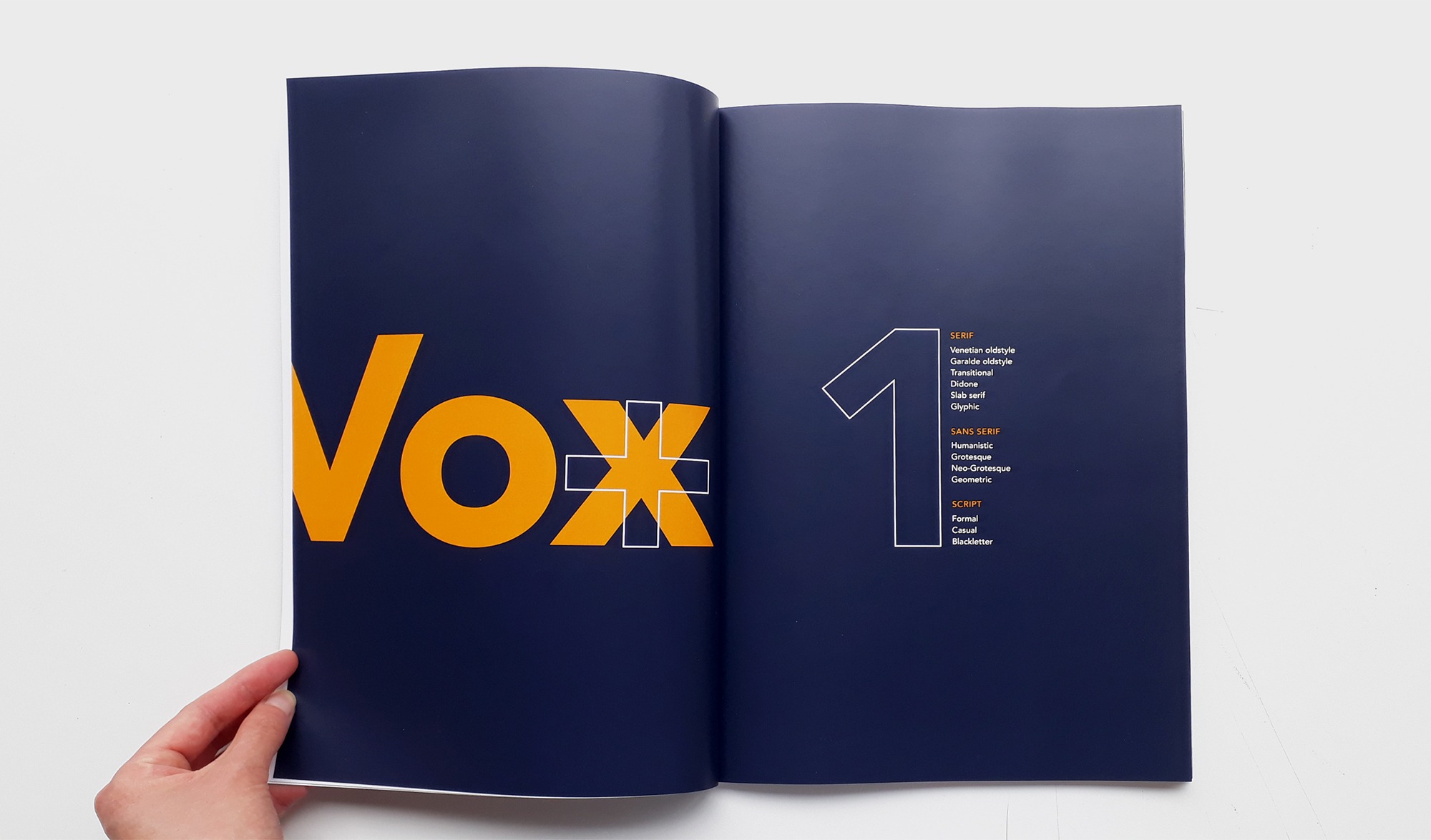
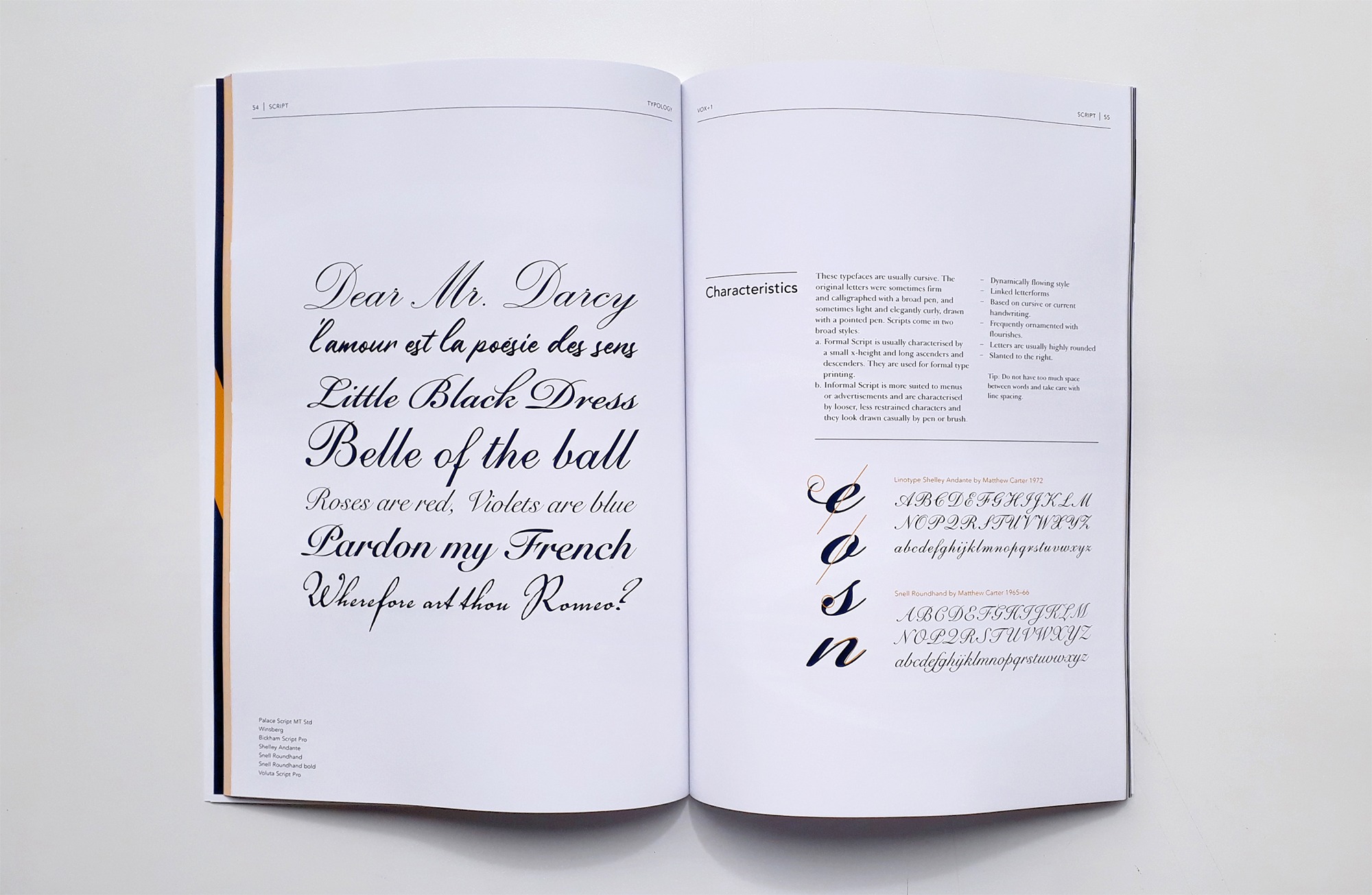
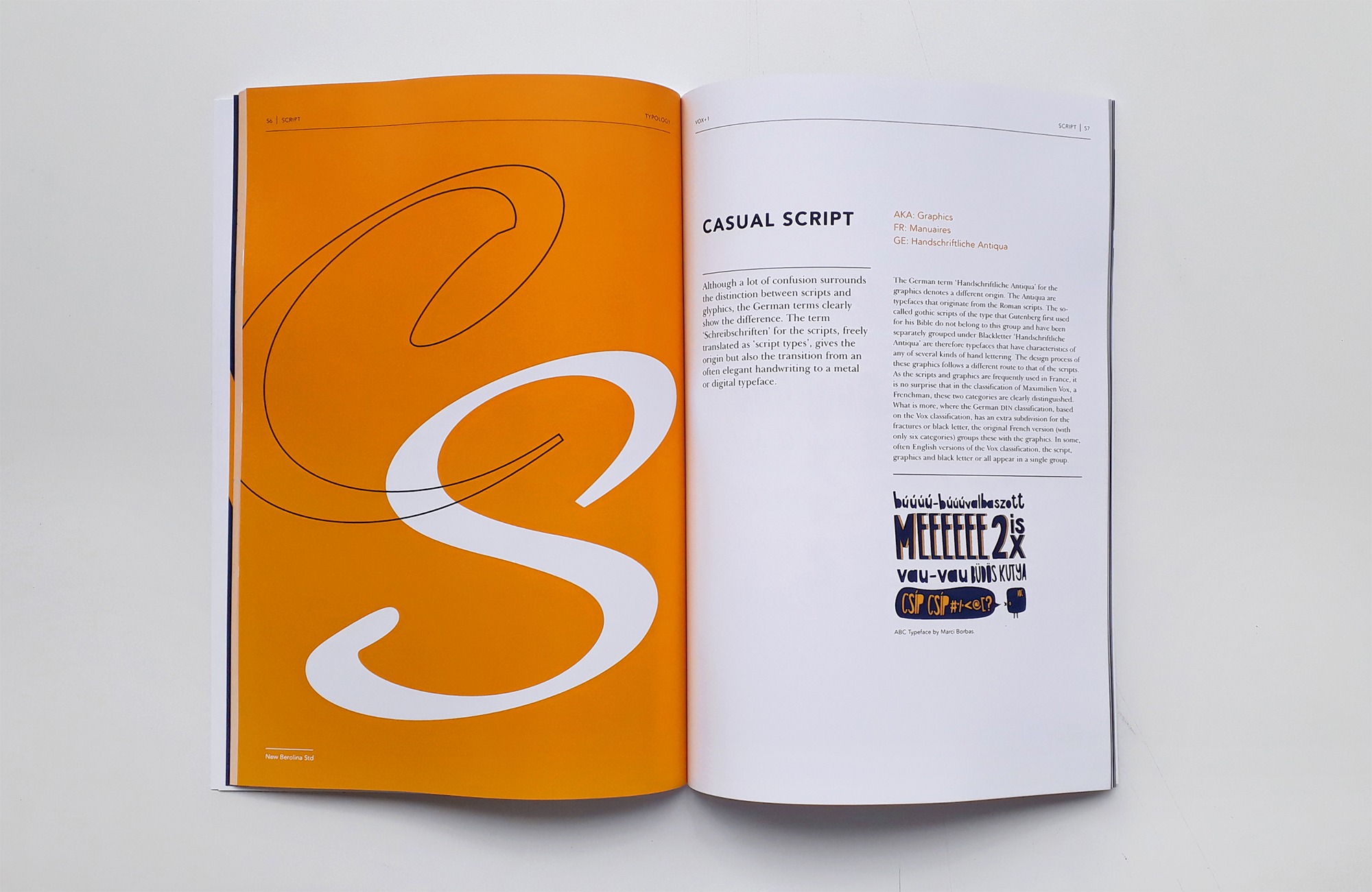
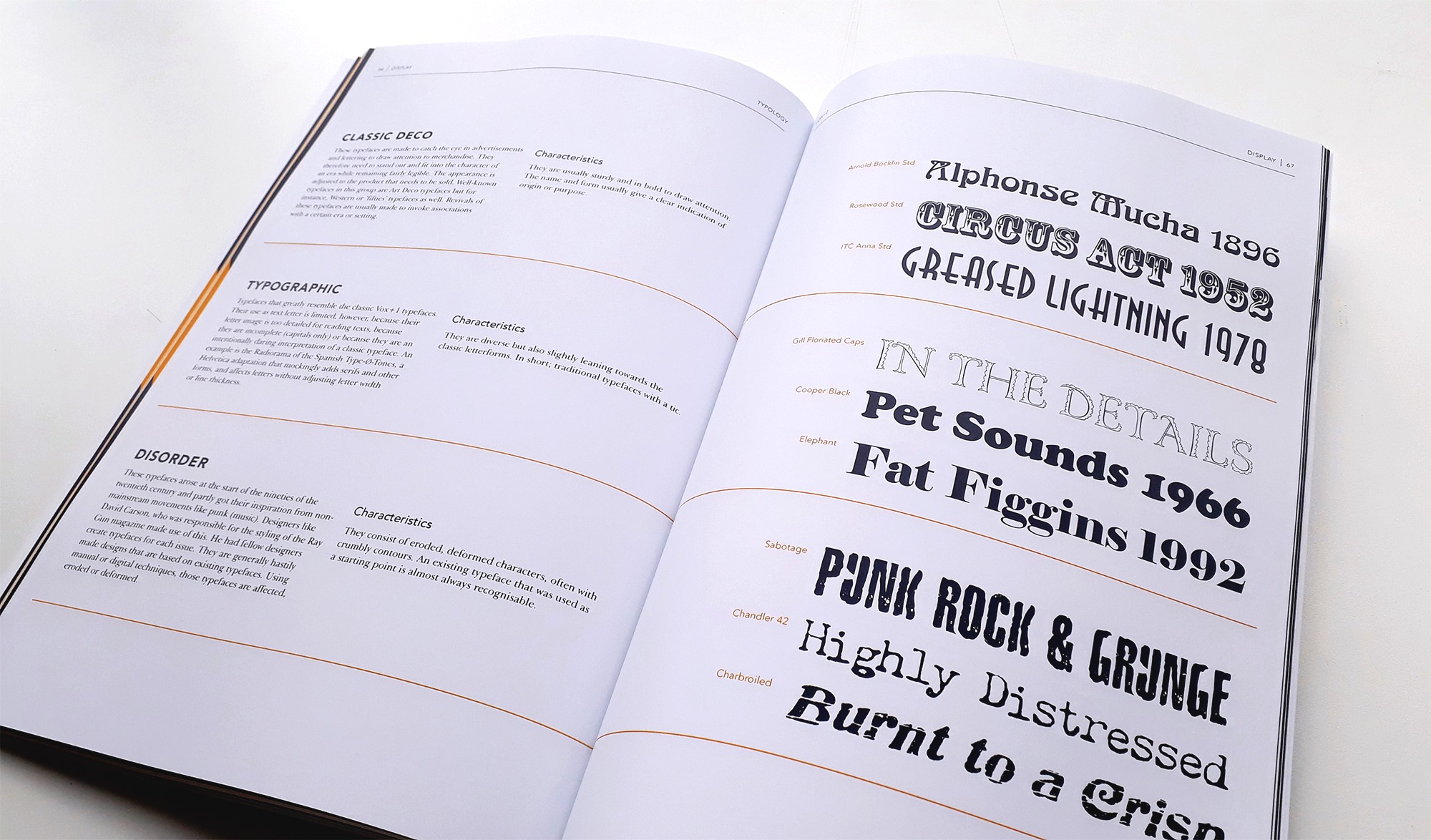
Typology
Editorial Design + Typography
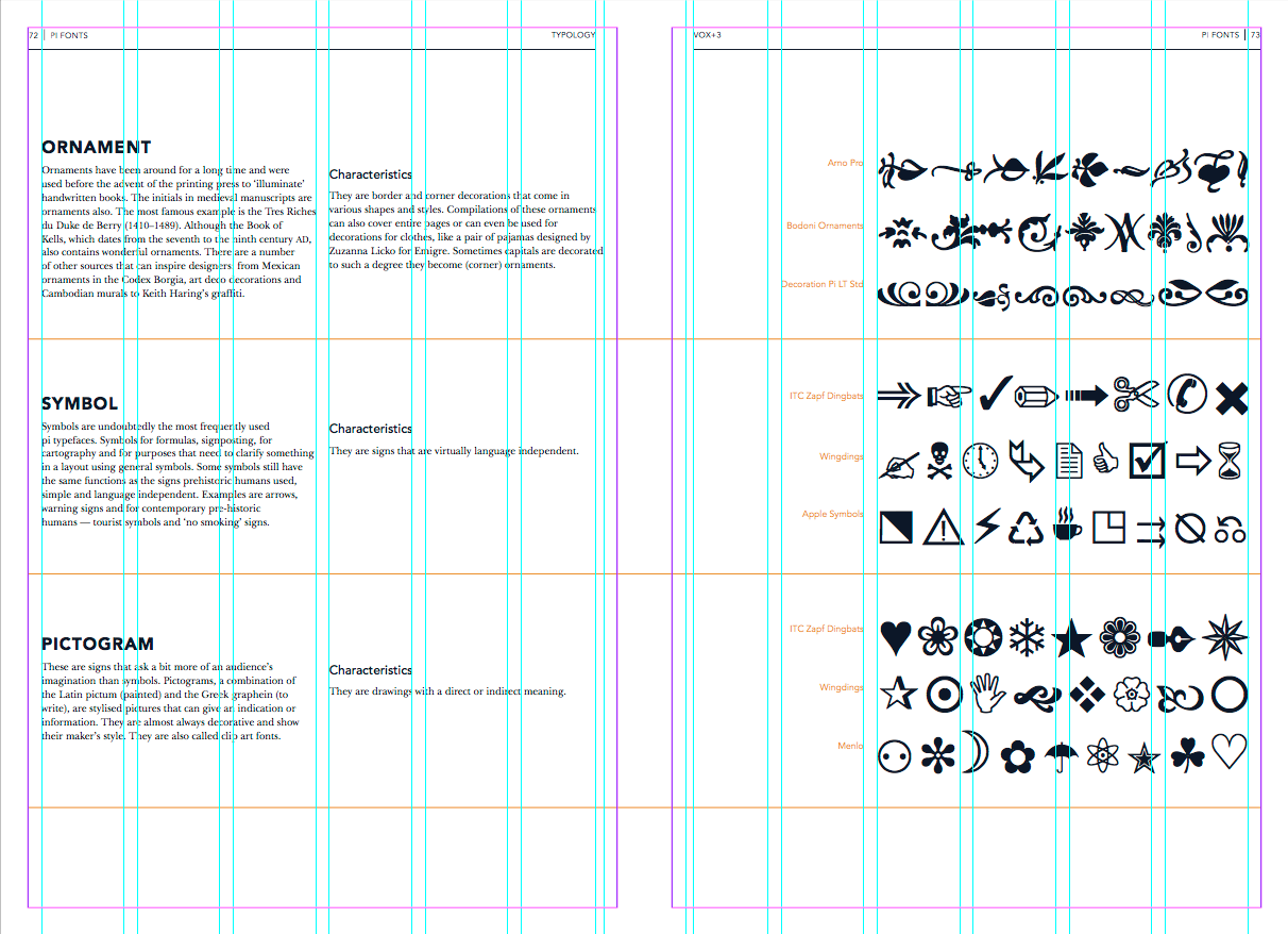
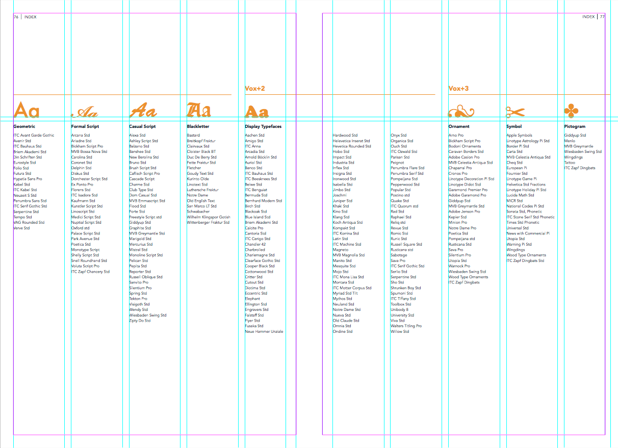
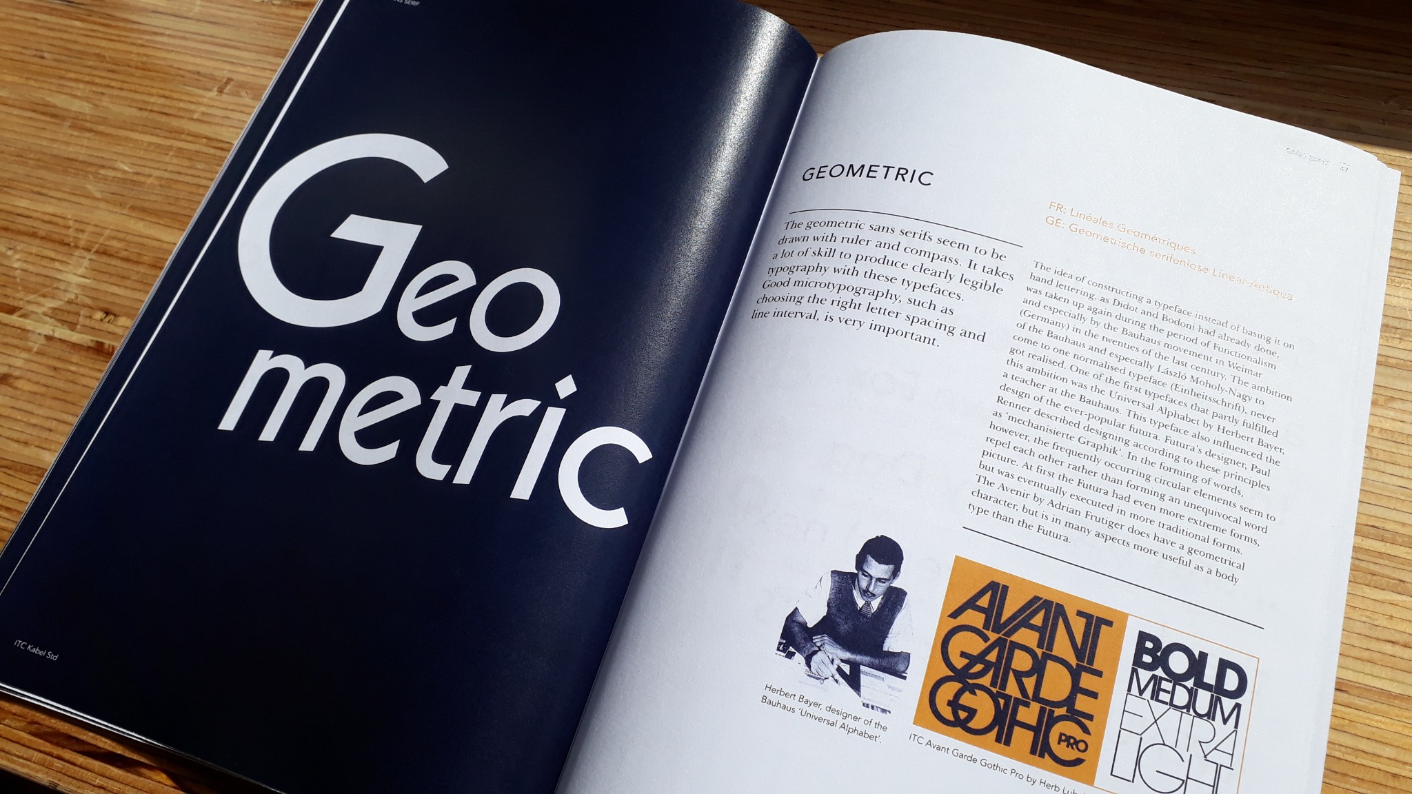
Typology is a showcase of typefaces from the Vox+ type classification system, and can be used as a "typeface dictionary." The format is a 2-in-1 tête-bêche book withTypology on one side, and type specimen Elephant, on the reverse side. The specimen dives into the history and characteristics of the typeface, Elephant, by Matthew Carter.
This project demonstrates the use of grids, editorial layout, typography, colour, and designing for print.
Tools: InDesign and Photoshop. The final book is 200 x 290mm, 92 pages, printed on 128gsm silk matte stock.
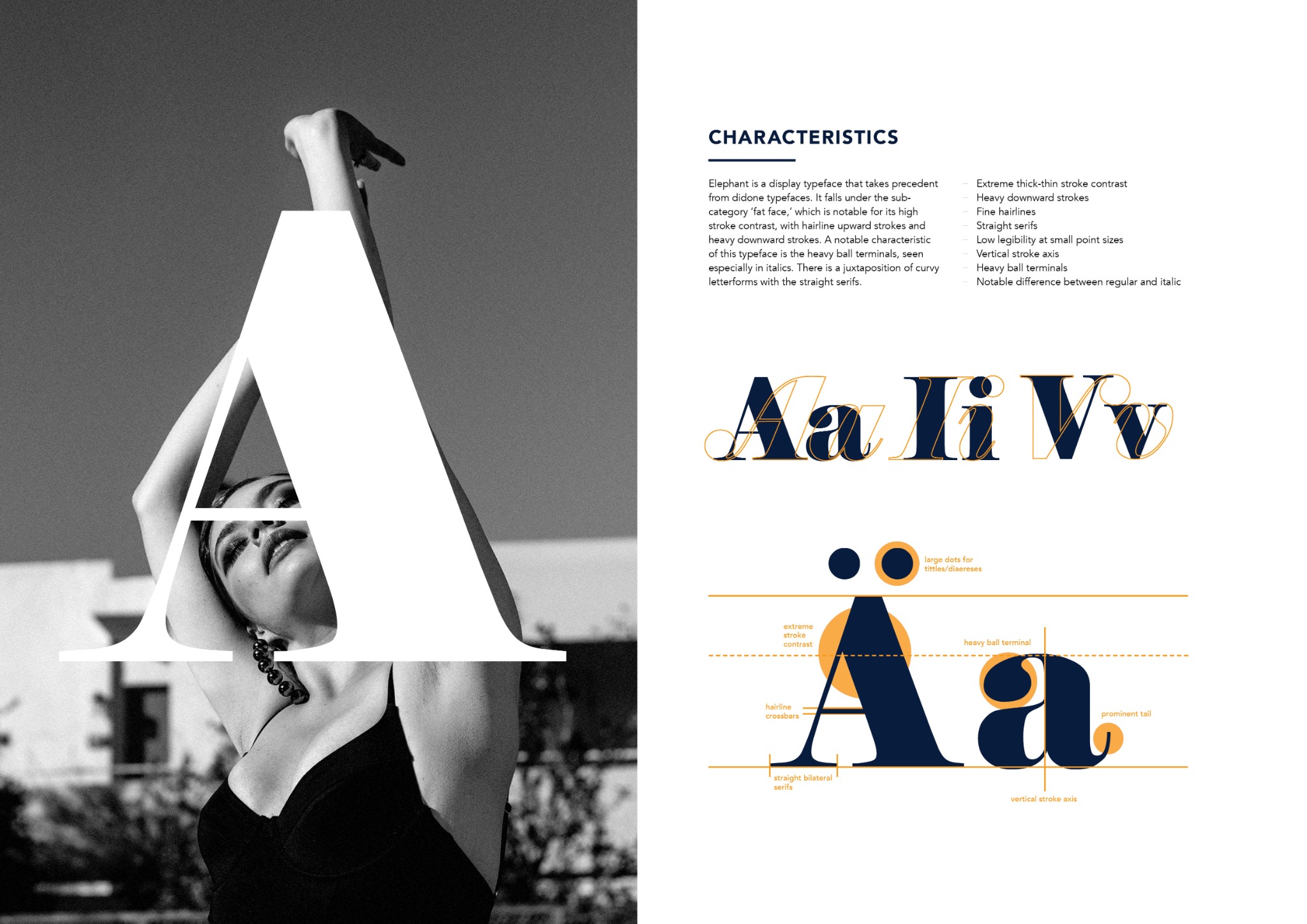
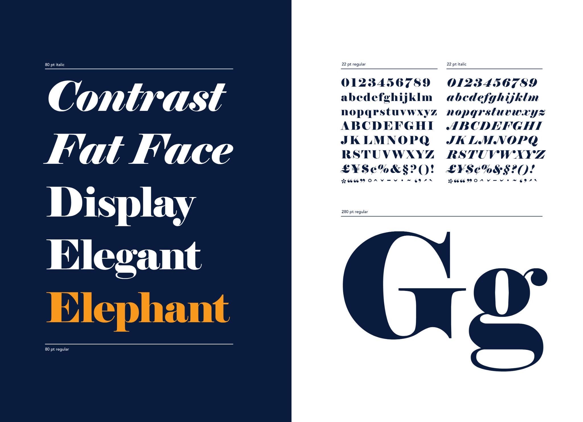
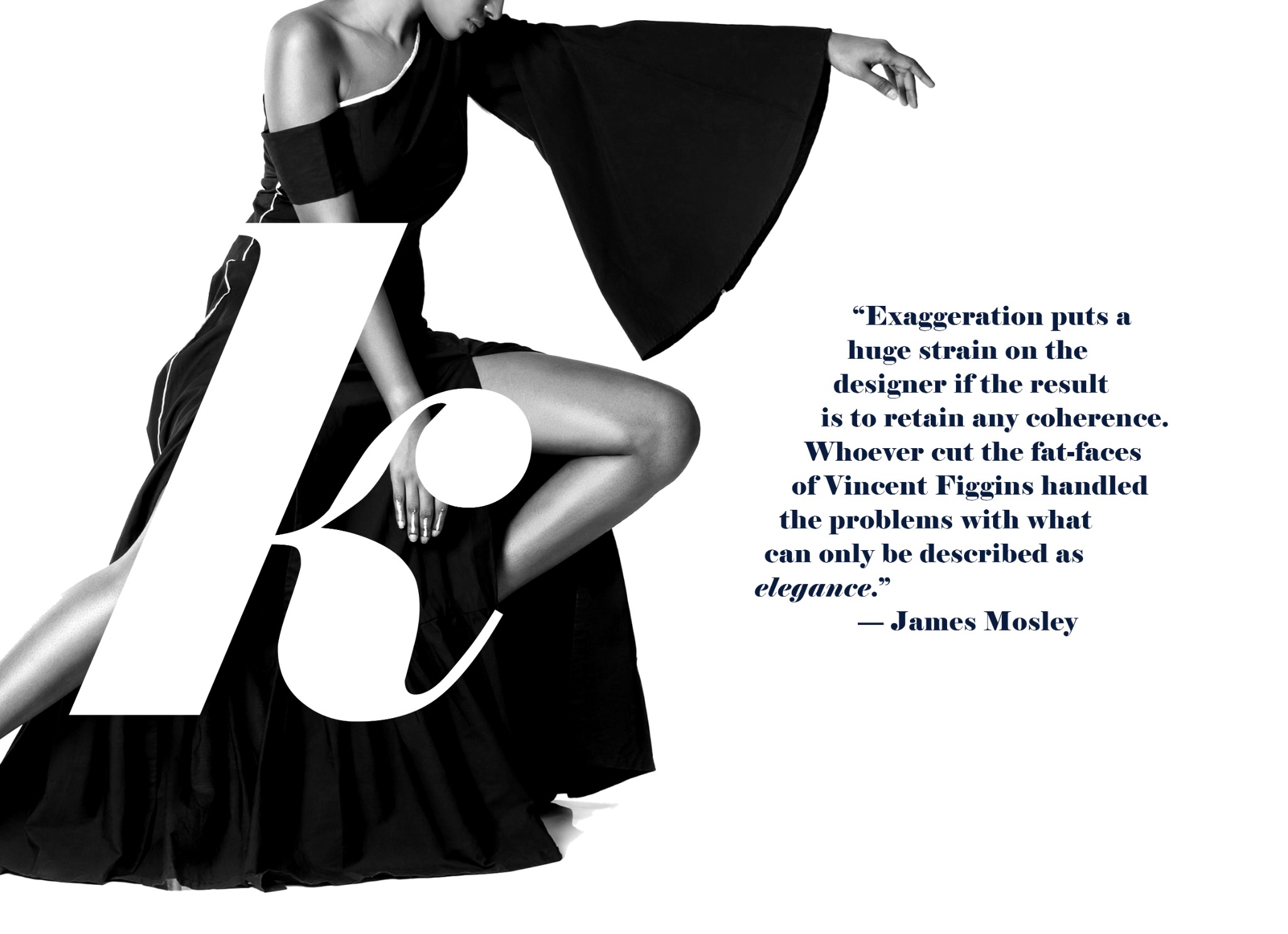
The typeface, Elephant, was designed by Matthew Carter in 1992 as a digital revival of Vincent Figgins’ ‘fat face’ typefaces.
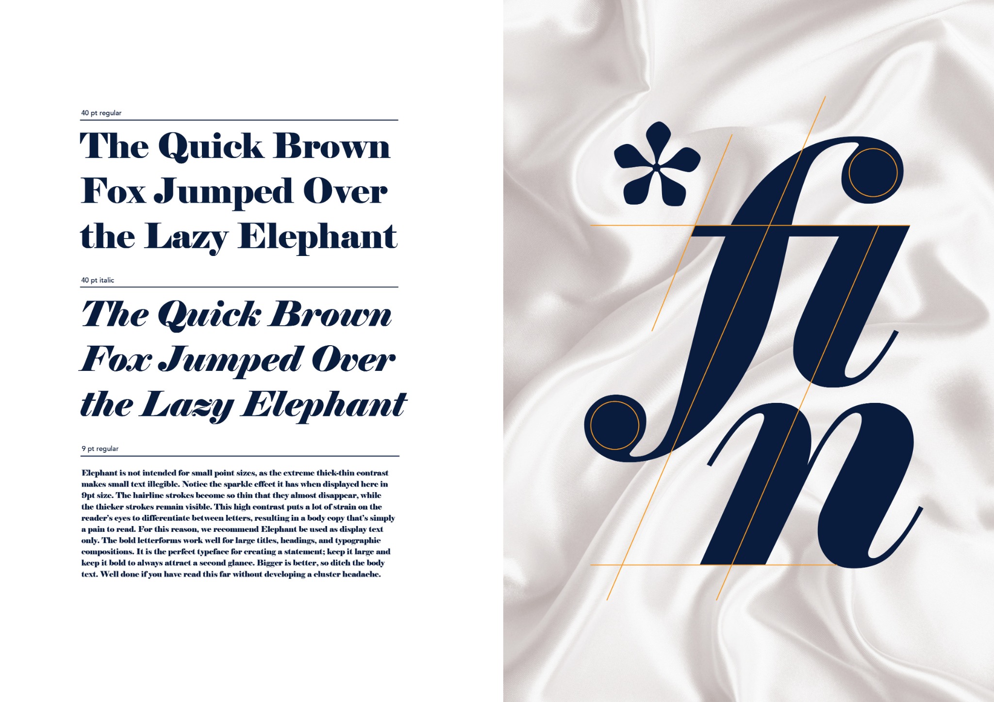
Elephant is a display font known for its high stroke contrast. The downward strokes are super heavy while the thin strokes remain as hairlines. For this reason, Elephant is best used in larger point sizes as headings and titles.
This style of lettering is commonly associated with fashion magazines such as Elle, Vogue, and Harper’s Bazaar. My book adopts a tête-bêche format as a deliberate nod to these publications. The font is showcased in context by pairing the letters/glyphs with fashion photography
A grid system is used to define the layout and placement of elements on a spread